AI Vs. complex dashboard pt.1
Lovable and Bolt.new
I asked five AI design tools to create a logistic dashboard
When AI tries to track a delivery
As a designer, I am equal parts curious, skeptical, and a little uneasy about AI creeping into our field. On one hand, I want to know what these tools can really do. On the other, I worry that if they are good enough, they might one day threaten my job, or worse, flood the world with mediocre design at scale.
Thing is, AI in design is not a question of if but of it's already here, what am I going to do about it? As a designer, I could spend my energy pushing back, stomping my feet and insisting that no machine can ever match me, but It is not a battle I would win. So, instead, I decided to lean into it: if AI is here to stay, then the smarter move is to explore what it can (and cannot) do, and figure out how it might fit into my work. Not as a replacement, but maybe as a collaborator, a starting point, or even just a faster way to get from zero to something.
To test this idea, I turned to a topic I know well: the design of a dashboard for logistics, something that could represent a real challenge in the real worlds, with different statuses, tables and filters.
The goal was not to crown a winner, but to understand how each tool interprets the same challenge what they nailed, where they stumbled, where I failed and what this might mean for us as designers learning to live with AI.
To test this idea, I turned to a topic I know well: the design of a dashboard for logistics, something that could represent a real challenge in the real worlds, with different statuses, tables and filters.
The goal was not to crown a winner, but to understand how each tool interprets the same challenge what they nailed, where they stumbled, where I failed and what this might mean for us as designers learning to live with AI.
Methodology
A landing page would have been too easy, AI tools love big images and catchy headlines. To really test them, I gave each the same brief: a operational dashboard layout combining KPI cards, a table of active shipments with statuses, filters, and a live map. This is the kind of interface where clarity and usability matter more than pretty visuals.
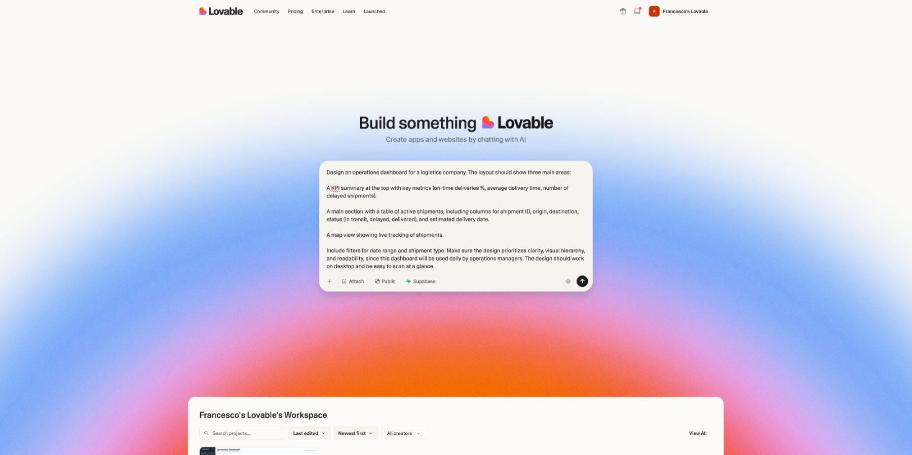
Design an operations dashboard for a logistics company. The layout should show three main areas:
1. A KPI summary at the top with key metrics (on-time deliveries %, average delivery time, number of delayed shipments).
2. A main section with a table of active shipments, including columns for shipment ID, origin, destination, status (in transit, delayed, delivered), and estimated delivery date.
3. A map view showing live tracking of shipments.
Include filters for date range and shipment type. Make sure the design prioritizes clarity, visual hierarchy, and readability, since this dashboard will be used daily by operations managers. The design should work on desktop and be easy to scan at a glance.
1. A KPI summary at the top with key metrics (on-time deliveries %, average delivery time, number of delayed shipments).
2. A main section with a table of active shipments, including columns for shipment ID, origin, destination, status (in transit, delayed, delivered), and estimated delivery date.
3. A map view showing live tracking of shipments.
Include filters for date range and shipment type. Make sure the design prioritizes clarity, visual hierarchy, and readability, since this dashboard will be used daily by operations managers. The design should work on desktop and be easy to scan at a glance.
The prompt
For this experiment I focused on five tools that represent different takes on AI-assisted design and development:
- Lovable – markets itself as a “prompt to product” tool. You describe what you want, and it tries to deliver a working app with UI, backend, and hosting.
- Bolt.new – similar in ambition, but more developer-oriented. It scaffolds full-stack applications from prompts, with more attention to code structure than visual polish.
- Base44 – another prompt-to-app generator, aiming for a slightly more disciplined output than Lovable while still keeping things simple.
- Replit (with Ghostwriter) – primarily an online coding environment. Its AI can generate UI and functionality from prompts, but it is closer to a developer’s assistant than a design generator.
- Figma AI (Build) – works directly inside Figma. It can spin up layouts from prompts, and because it sits in the design tool many of us already use, it’s more natural for iteration and refinement.
What I looked at
Since this experiment happens in a vacuum, with no deadlines, no tech stack constraints, no stakeholder request, I could judge the outputs purely on their design merits. I focused on whether the tools respected the prompt or defaulted to generic layouts, how clear the visual hierarchy was, and whether the spacing and typography felt consistent. I looked at the usability of filters and tables, because a dashboard lives or dies on how scannable its data is. I also checked for even a hint of accessibility awareness, like colour contrast or readable text, though I did not expect much. Finally, I asked myself the practical question: is this something I could iterate on, or is it so off the mark that it should be discarded entirely?
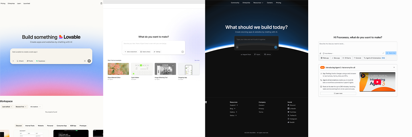
All tools use a very similar interface when it comes to prompts, a sign that this has become a common UX pattern
Lovable
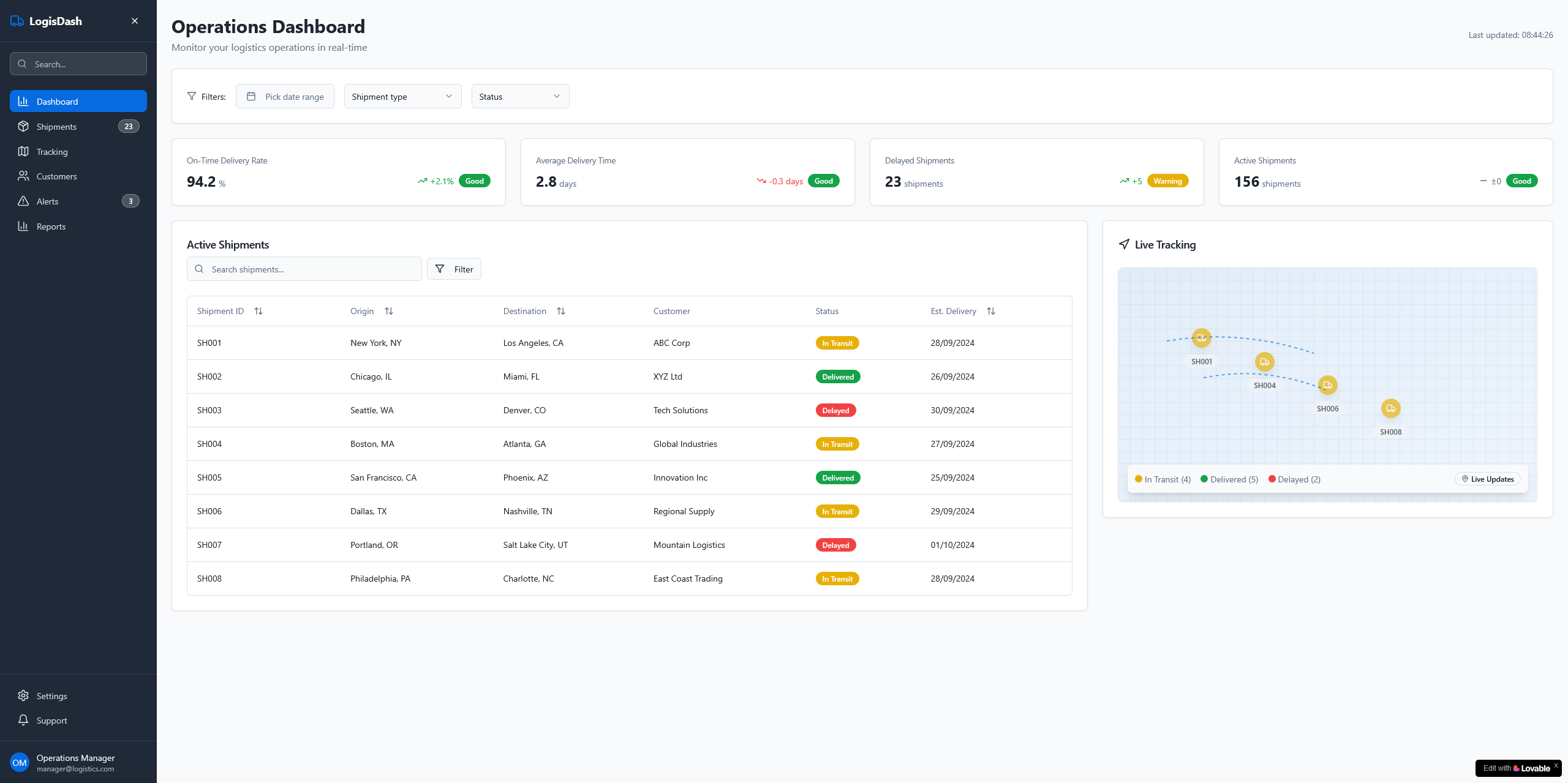
The initial impression is positive: this looks like a ready-made admin template adapted to a logistics context. It is clean, consistent, and immediately usable, though it feels somewhat generic.
prompt fidelty
It covered all the basics, KPI cards, shipment table, map view, filters. It even went a step further by suggesting a side navigation for the dashboard, complete with counters for actionable items like alerts. The shipment counter makes less sense in reality (hundreds of shipments are not “countable” this way), but it shows an effort to expand on the prompt rather than just meeting it.
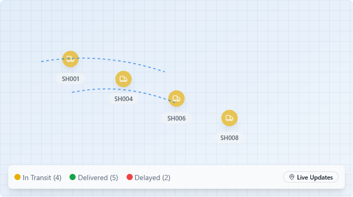
A map is never going to be useful, but it's the ultimate eye-candy. This one is particularly unhelpful.
Visual hierarchy, space, tipography
Spacing and typography are consistent, leaning toward a “Bootstrap” look but still workable. The KPIs at the top are clear and well separated into cards. The “On-Time Delivery Rate” stands out correctly, though all the cards carry the same weight, so it is not obvious which one is most important. That was not specified in the prompt, so it remains a solid starting point. Some of the trend/status combinations, however, make little sense and would need refining.

The delivery time is trending down (in red), but it's also "Good". The delayed shipments are increasing and there's also a warning. Trend and statuses make no sense in conjunction with each other.
Filters and table
The cracks begin to show in the filters and table. There are two filter sections: one at the top of the page (date range, shipment type, status, plus a clear-all option) and another above the table, with a search and a filter button. It is not clear how these sets relate to each other and in the Lovable prototype, neither actually works. The filtering and search flow would be broken.
The table itself is readable, but in reality it would need more columns (assignee, size, weight, etc.) to be useful. It is also missing a way to filter by customer name. The status chips are color-coded, but including “Delivered” in an Active Shipments table is a logic error (delivered shipments no longer belong there).
The table itself is readable, but in reality it would need more columns (assignee, size, weight, etc.) to be useful. It is also missing a way to filter by customer name. The status chips are color-coded, but including “Delivered” in an Active Shipments table is a logic error (delivered shipments no longer belong there).
Accessibility
The KPI trends combine colour with icons (up/down arrows), which is helpful. The status chips are colour-coded but would benefit from icons as well. Text is slightly small, and the table lacks zebra striping, which would improve scan-ability. Contrast is acceptable but not tuned for accessibility.
Iteration potential
On the HTML side the output is surprisingly tidy. The div structure is clean and logical enough that I wish some of my Figma hand-offs looked like this. A quick “highlight all elements” pass shows a clear structure with sensible grouping.
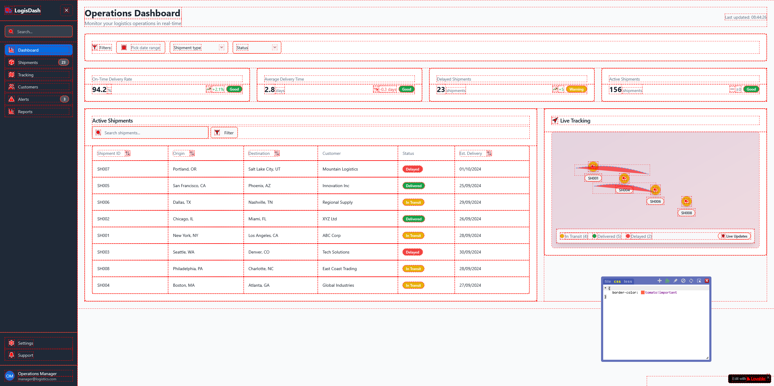
Divsception is not that bad
CSS is where it slips. It looks like almost every element is styled in isolation, backed by a ~3,000-line stylesheet full of near-duplicate classes that vary by single rem steps. It reads like a utility library with a lot of unused rules. The result is bloat, weak reuse, and styles that will be hard to maintain.
As it stands this is a workable first step, not production-ready. Filters need clearer ownership and behaviour, KPIs need prioritisation, and the table will not scale to real operational data density.
Responsiveness shows only a hint of intent: most blocks simply stack into one column. Whether a full mobile layout is required depends on the audience and stakeholders, but if mobile matters this needs a deliberate strategy rather than a collapse-and-pray approach.
As it stands this is a workable first step, not production-ready. Filters need clearer ownership and behaviour, KPIs need prioritisation, and the table will not scale to real operational data density.
Responsiveness shows only a hint of intent: most blocks simply stack into one column. Whether a full mobile layout is required depends on the audience and stakeholders, but if mobile matters this needs a deliberate strategy rather than a collapse-and-pray approach.
Bolt.new
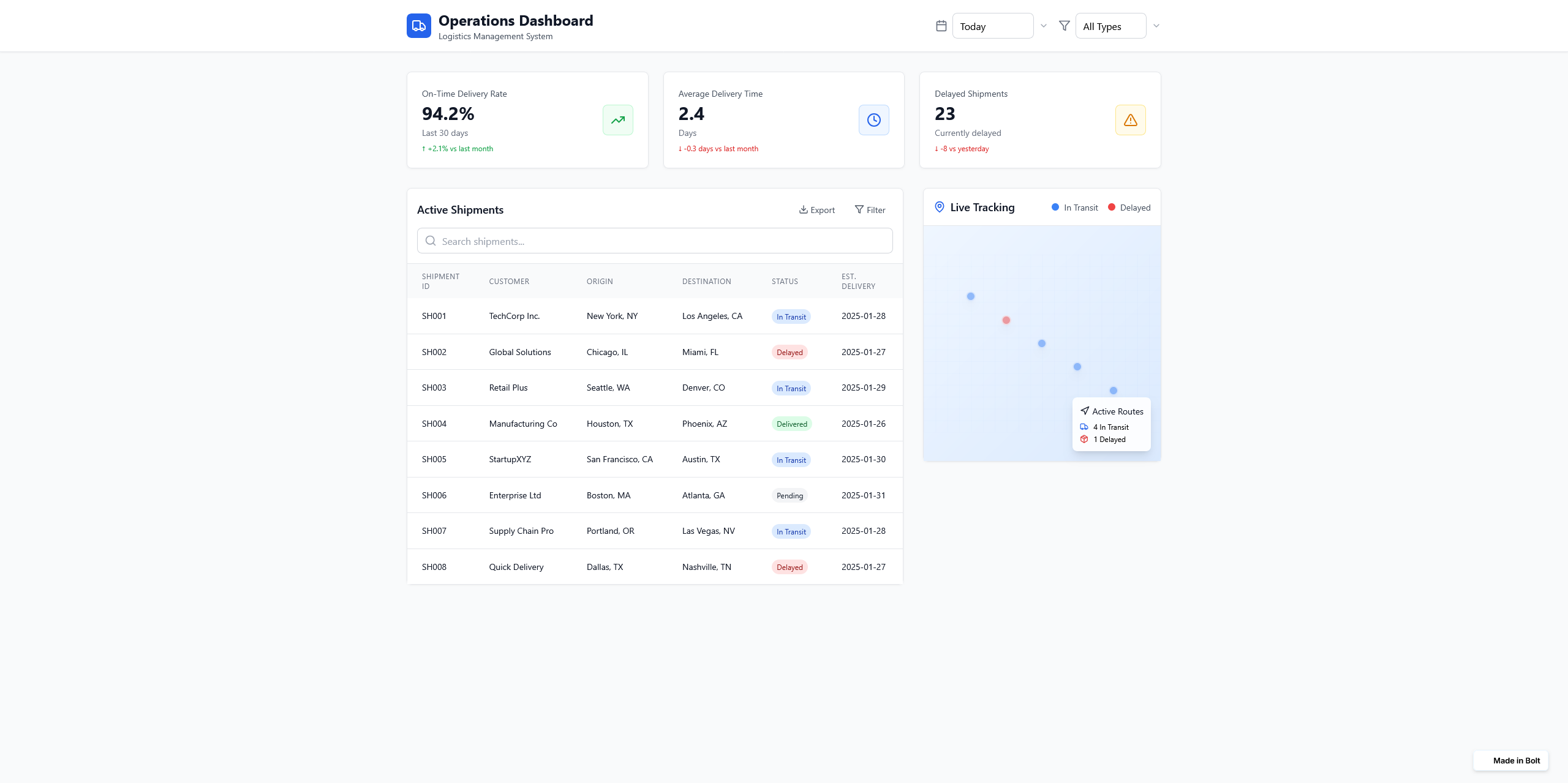
Very clean and minimal. It looks less like a polished product UI and more like a developer structure: clear, with neutral styling, and just enough visual design to be usable. Compared to Lovable’s more “designed” template, this feels even more barebones, which matches the mission of the Company to be a developer helper more than a designer tool.
prompt fidelty
Same as for Lovable, all the main pieces are here: the KPI cards, the shipment table, the filters, the map, all seems to be accounted for. This time the dashboard has no navigation, so it did its work and never steered from the prompt, apart from the addition of the "Pending" status, which is a nice bonus.
As always, the map is super abstract, it holds no significance and probably it would also be the case in a production environment.
As always, the map is super abstract, it holds no significance and probably it would also be the case in a production environment.
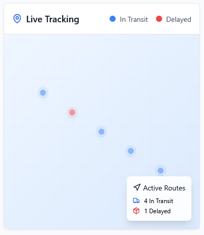
These deliveries must be lost in the void
Visual hierarchy, space, tipography
The typography is clean and readable, everything is well aligned and seems to have balance, but also looks like a wireframe with a bit of styling, very functional. This is not necessarely a downside, of course, it just contributes to the sense of put-togetherness without any real process of thought. Once again, the KPIs make zero sense, bot internally and in within each other.
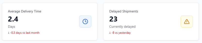
Somehow being less punctual and having less delayed shipments are both negative KPIs
Filters and table
The filters are possibly the worst iteration I've seen so far in my experiment. There's a search bar, a non-functional "Filter" button and no possible sorting whatsoever on the table. This would require a possible UX/UI designer to take care of the filters from scratch and a developer to rework this entire part. The table itself is still quite limited, and except for the introduced "Pending" status, it has no real-life value: a real dashboard would have way more operational fields
Accessibility
All statuses are correctly color code: green is good, blue and grey requires no immediate action and red is bad. The contrast is acceptable but very light overall. The KPI cards rely on confusing color matching and the icons are not helping a possible color blind user to understand what's happening. The table is readable, but still it would be better to add different colors to alternate stripes to make it more readable.
Iteration potential
HTML structure is clean. Of course this test is based on quick observation rather than any deep investigation, but the bones seem pretty solid.
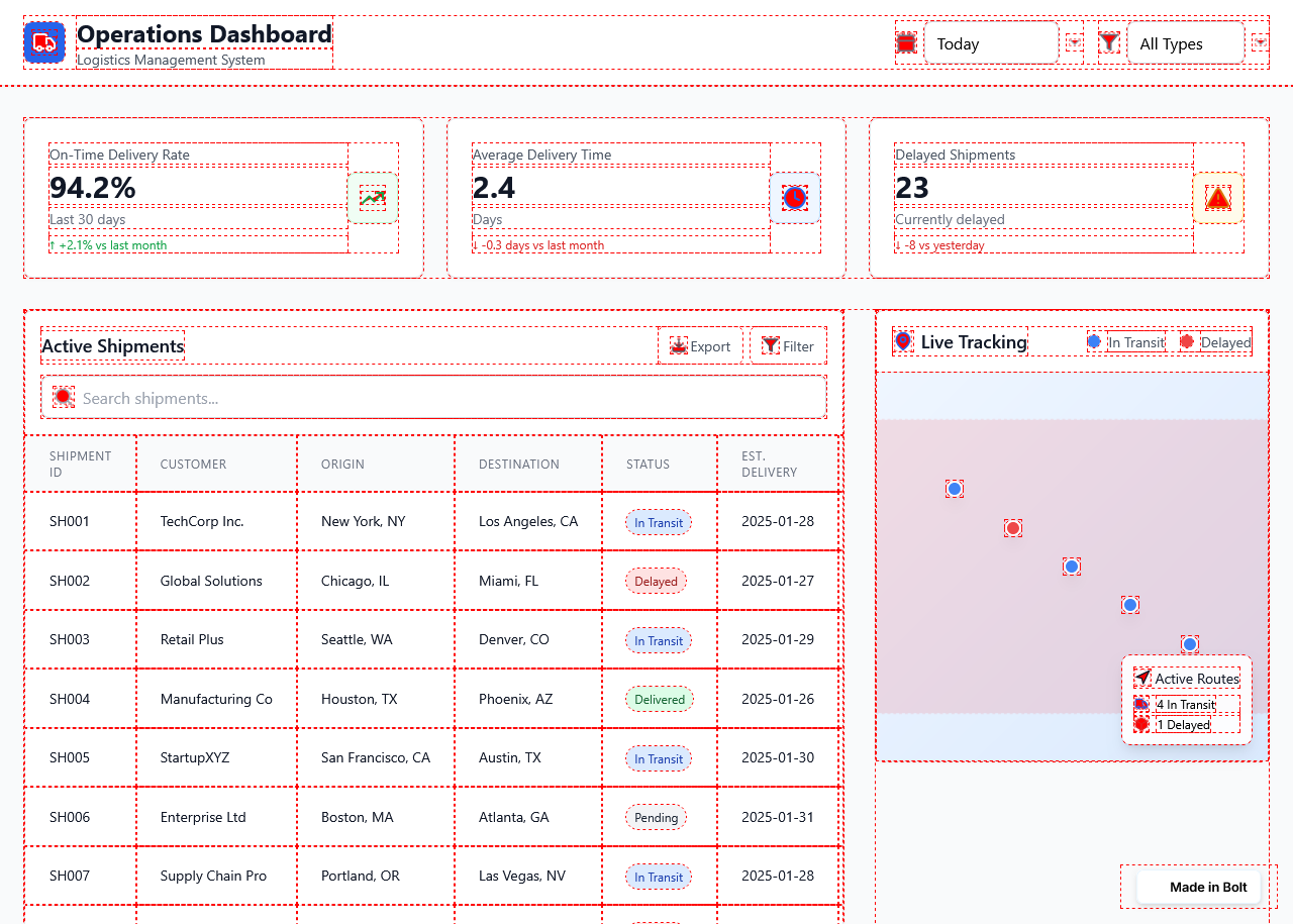
A tad more complex than lovable
Curiously, I noticed the same CSS classes being used by Lovable in this project, which confirms my assumption that probably they are both using the same bootstrap stylesheet.
Bolt put zero effort in a mobile version, not even a simple stacking is available. This entire project, if it were to be used for shipping in production, would need significant design attention: a different KPI interpretation, some workable filters. Once again what looked acceptable at first quickly became a future implementation nightmare.
Bolt put zero effort in a mobile version, not even a simple stacking is available. This entire project, if it were to be used for shipping in production, would need significant design attention: a different KPI interpretation, some workable filters. Once again what looked acceptable at first quickly became a future implementation nightmare.
Coming next...
So far, Lovable and Bolt.new show two sides of the same coin: one tries to look more “designed” but collapses under scrutiny, the other sticks closer to developer scaffolding but leaves huge UX gaps. In the next post, I turn to three very different players: Replit, with its developer-first approach, Base44, another contender in the prompt-to-app space, and Figma’s own AI features, which bring generation directly into the tool most designers already use. The question is whether any of them can move past generic scaffolding and deliver something closer to a usable product.