The UX and UI for two B2B portals (at once)
from back-office tool to user-focused portal
Get-e connects airlines, insurers, and travel platforms with ground transportation providers worldwide. To make this work, two groups rely on the core portal: customers booking rides and suppliers dispatching drivers.
The old portal had grown organically on outdated tech, partly mixed with internal back-office tools. Information was scattered, the interface inconsistent, and instead of helping people, it often slowed them down.
My role
I was the sole product designer on this project, responsible for the entire redesign of the core portal. My work included building a component library in Figma based on an established system, mapping the main flows, and defining personas for customers and suppliers. I then redesigned the interface to make it easier to use, structured around user goals, and proactive in suggesting solutions.
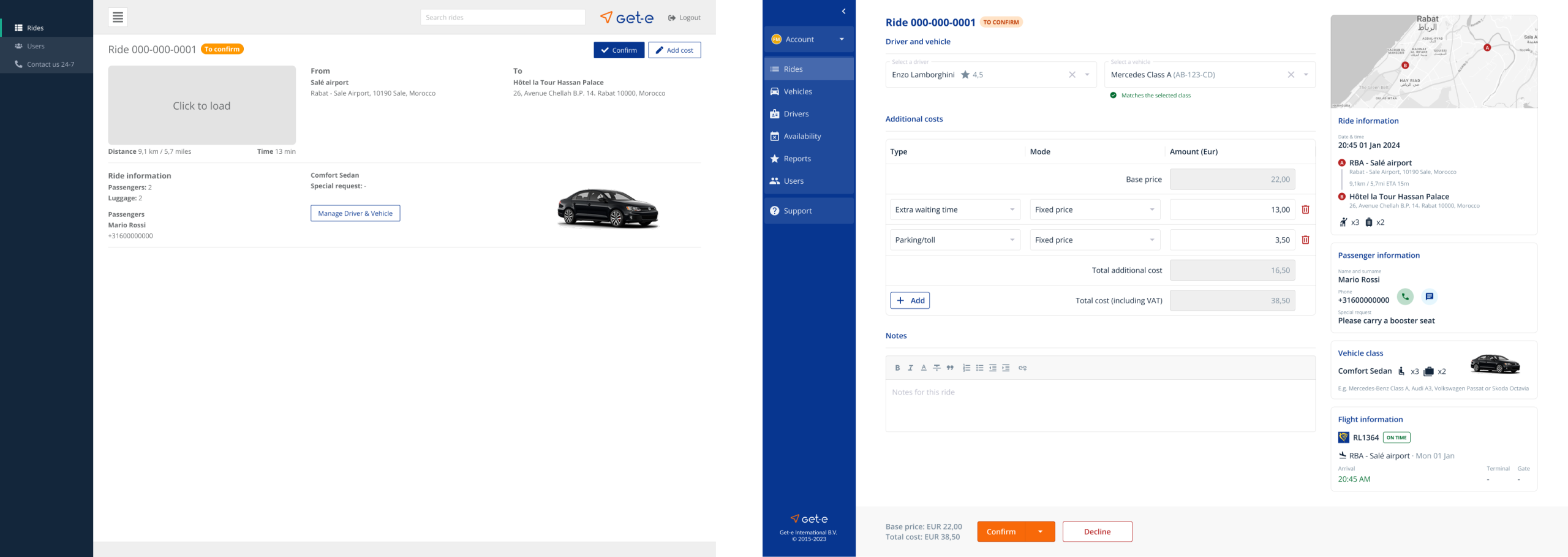
Evolution of the Get-e portal
The process
Research
The core portal had been patched together on old technology and grew organically over time, with little focus on user experience. UX maturity inside the company was low, so the platform ended up with a very basic UI and no real investigation into user needs.
To move forward, I first spoke with stakeholders and users on both sides, customers and transport suppliers, to understand how they currently used the portal. More importantly, I had to rebuild the existing flows of the old platform, since none were documented. This exercise revealed where the experience was fragmented, inconsistent, or simply too complex for everyday use.
To move forward, I first spoke with stakeholders and users on both sides, customers and transport suppliers, to understand how they currently used the portal. More importantly, I had to rebuild the existing flows of the old platform, since none were documented. This exercise revealed where the experience was fragmented, inconsistent, or simply too complex for everyday use.
I drive most of the day, but I still have to confirm rides and manage vehicles for my company. It’s too many screens for simple tasks.
Insight from a driver
Three were the main pain points
- Low UX/UI maturity - the portal was built on old technology with little focus on user experience, which led to an inconsistent and outdated UI.
- Inefficient workflows - customers and suppliers both struggled with fragmented flows that were not designed around their goals.
- No documentation - no process documentation existed, so I rebuilt the old flows to expose complexity and pain points.
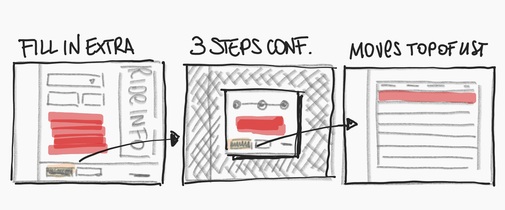
One striking example: a transporter gets a ride assigned and they need to confirm it. In the old portal, suppliers clicked through multiple screens and even a modal. In the redesign, it became one clear step. Bulk confirmation was explored, but stakeholders stressed the need for dispatchers to check each ride in detail.
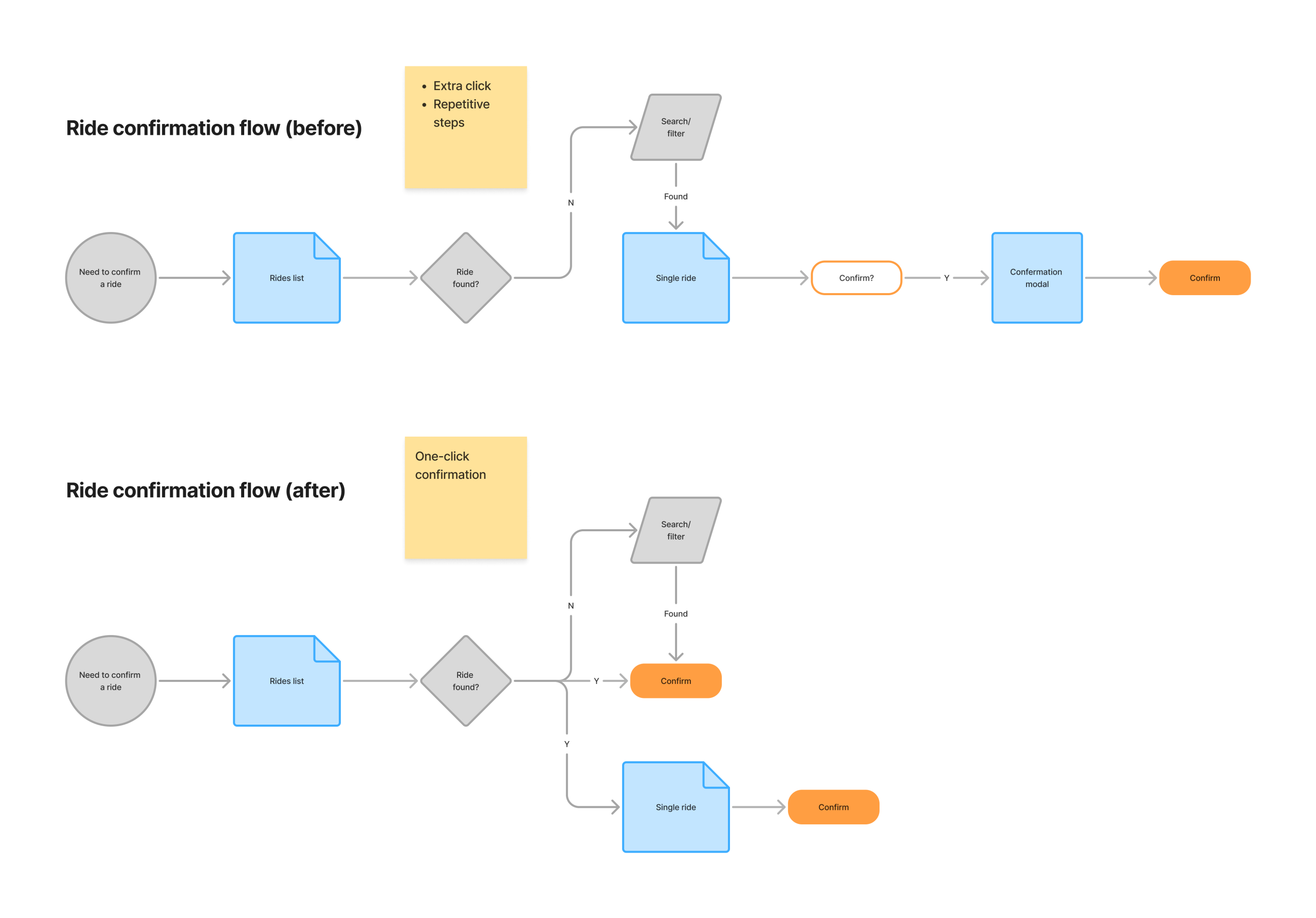
You can save everyone a few clicks just by optimizing certain flows
Define
When I started mapping personas, it quickly became clear that there was no such thing as "the customer" or "the supplier". On the customer side I looked at five very different company types: from a low-cost airline to a flagship carrier, from an insurance provider to an online travel agency, all the way to a small traditional travel agent.
Inside each company I considered the layers of people involved, from decision makers who cared about cost and policy, to managers translating those rules, to operations staff doing the daily ride monitoring, and finally the passengers themselves.On the supplier side the picture was simpler but in the same way important. I modeled large companies with owners, dispatchers and drivers working in separate roles, and small operators where the owner was also the driver and the dispatcher at the same time.
Inside each company I considered the layers of people involved, from decision makers who cared about cost and policy, to managers translating those rules, to operations staff doing the daily ride monitoring, and finally the passengers themselves.On the supplier side the picture was simpler but in the same way important. I modeled large companies with owners, dispatchers and drivers working in separate roles, and small operators where the owner was also the driver and the dispatcher at the same time.
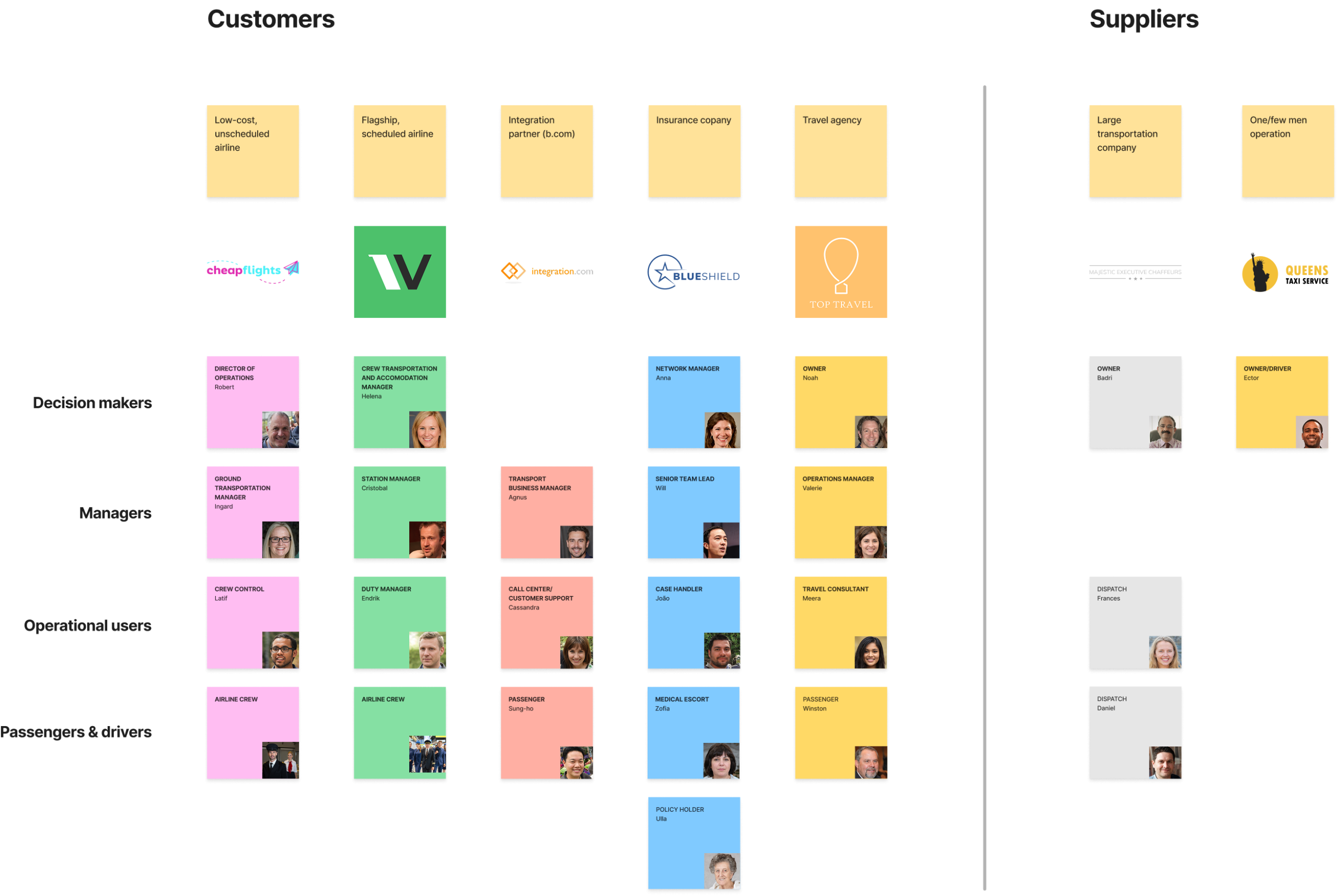
The amount of user persona created is enough to make your head spin
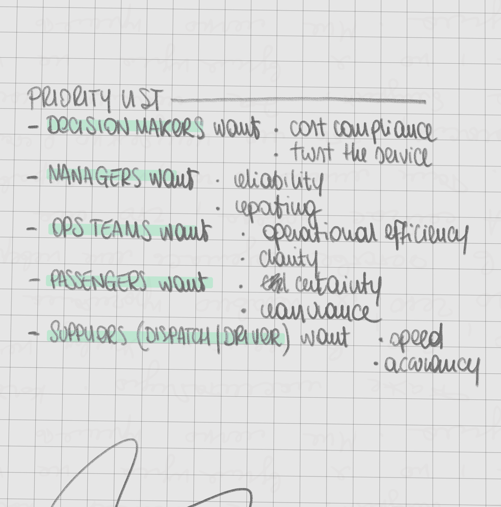
From personas to requirements
Exploring the personas made it obvious how different the needs could be. Insurance passengers might travel with medical escorts, which means arranging specialized vehicles and extra assistance. At the other end of the spectrum, low-cost airline crews are often booked into hotels far from the airport, so reliability and planning become the top priority. Flagship carriers, on the other hand, usually keep their crews close by, where speed and efficiency matter most.All of this underlined one thing: the new portal had to flex across very different scenarios, but still keep the core actions simple and dependable.
Design
The redesign recognized that customers and suppliers look at the same rides, but with different needs. Bookers want to monitor rides, update details, and reassure passengers. Dispatchers want to confirm rides quickly, assign drivers, and react to changes without losing time. The new portal surfaced the right information for each side.
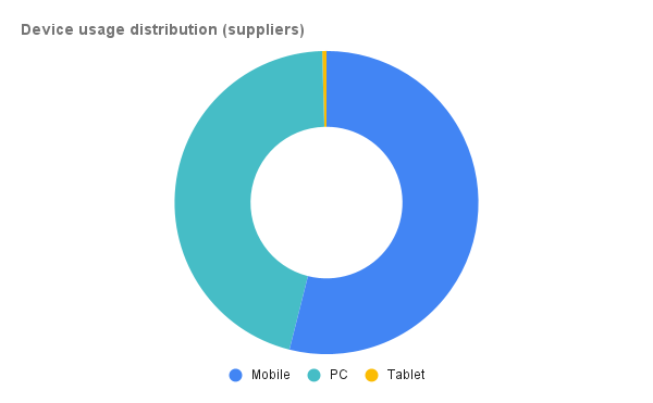
Mobile use was also critical. Around half of supplier traffic came from phones, and a simple responsive version was not enough. I designed a dedicated mobile experience where actions like confirming rides or updating availability were prioritized, giving dispatchers the ability to manage operations on the go.
Mobile use was also critical. Around half of supplier traffic came from phones, and a simple responsive version was not enough. I designed a dedicated mobile experience where actions like confirming rides or updating availability were prioritized, giving dispatchers the ability to manage operations on the go.
Quick actions at glance
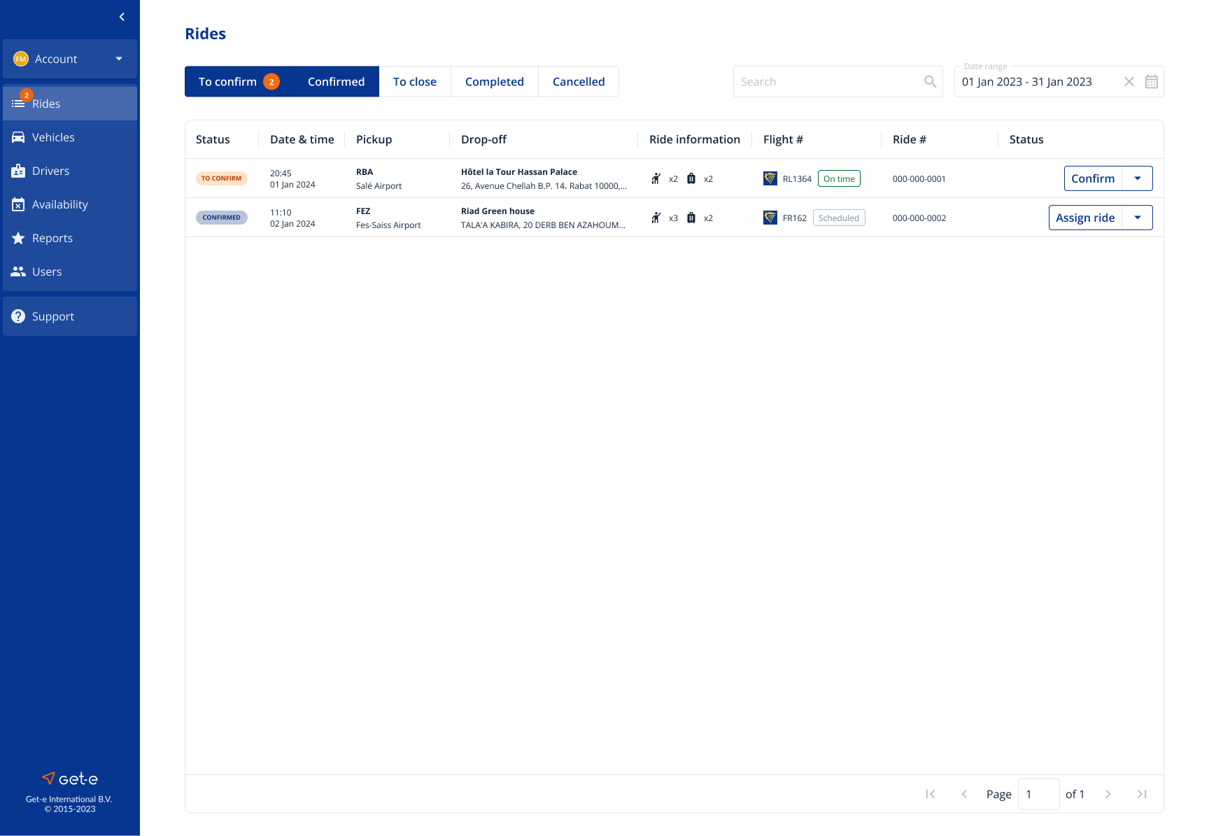
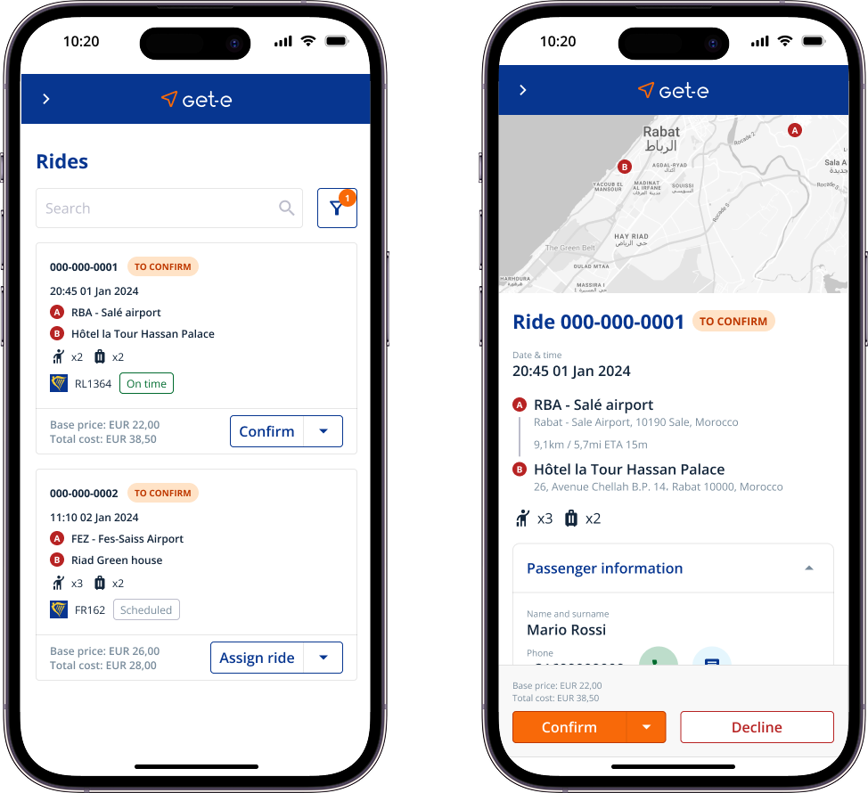
For suppliers, the overview highlights quick actions and flight updates. Dispatchers can confirm rides, assign drivers and react to delays directly from this screen.
Operational perspective
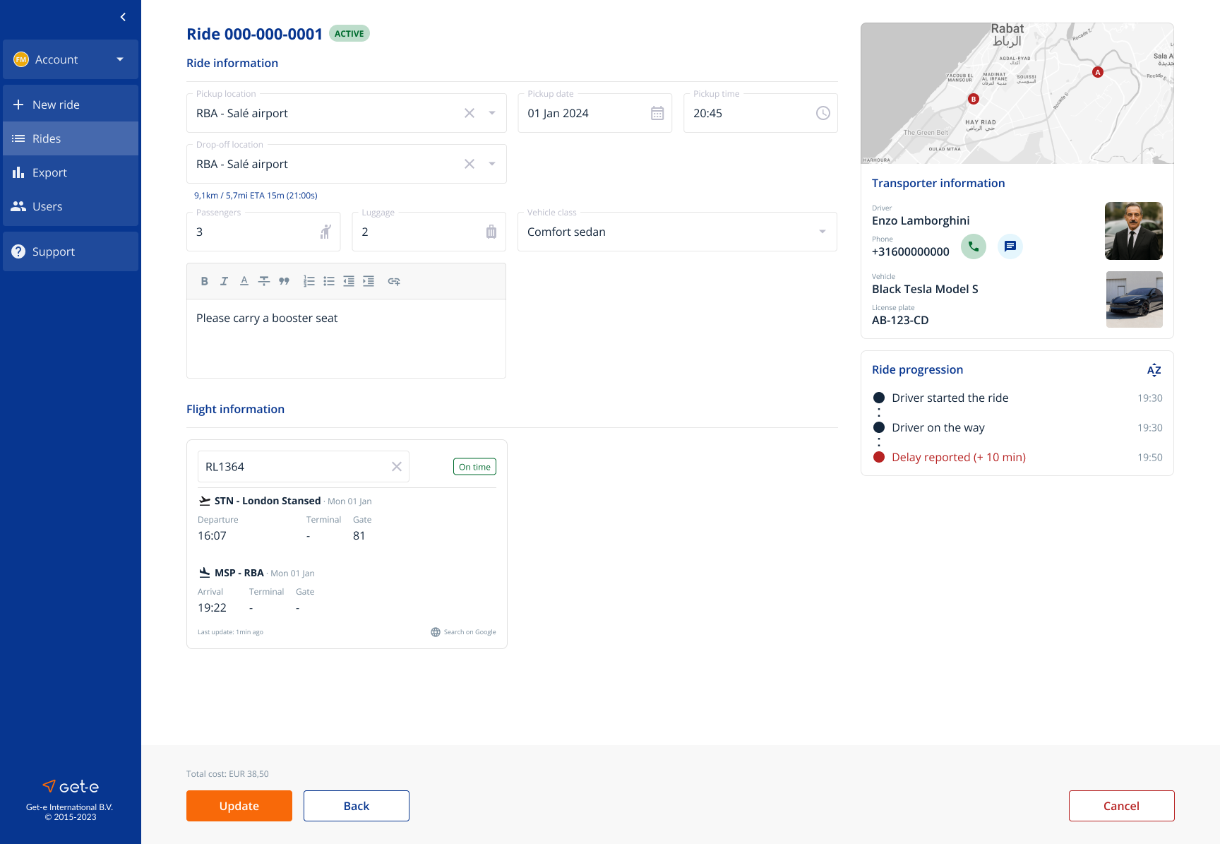
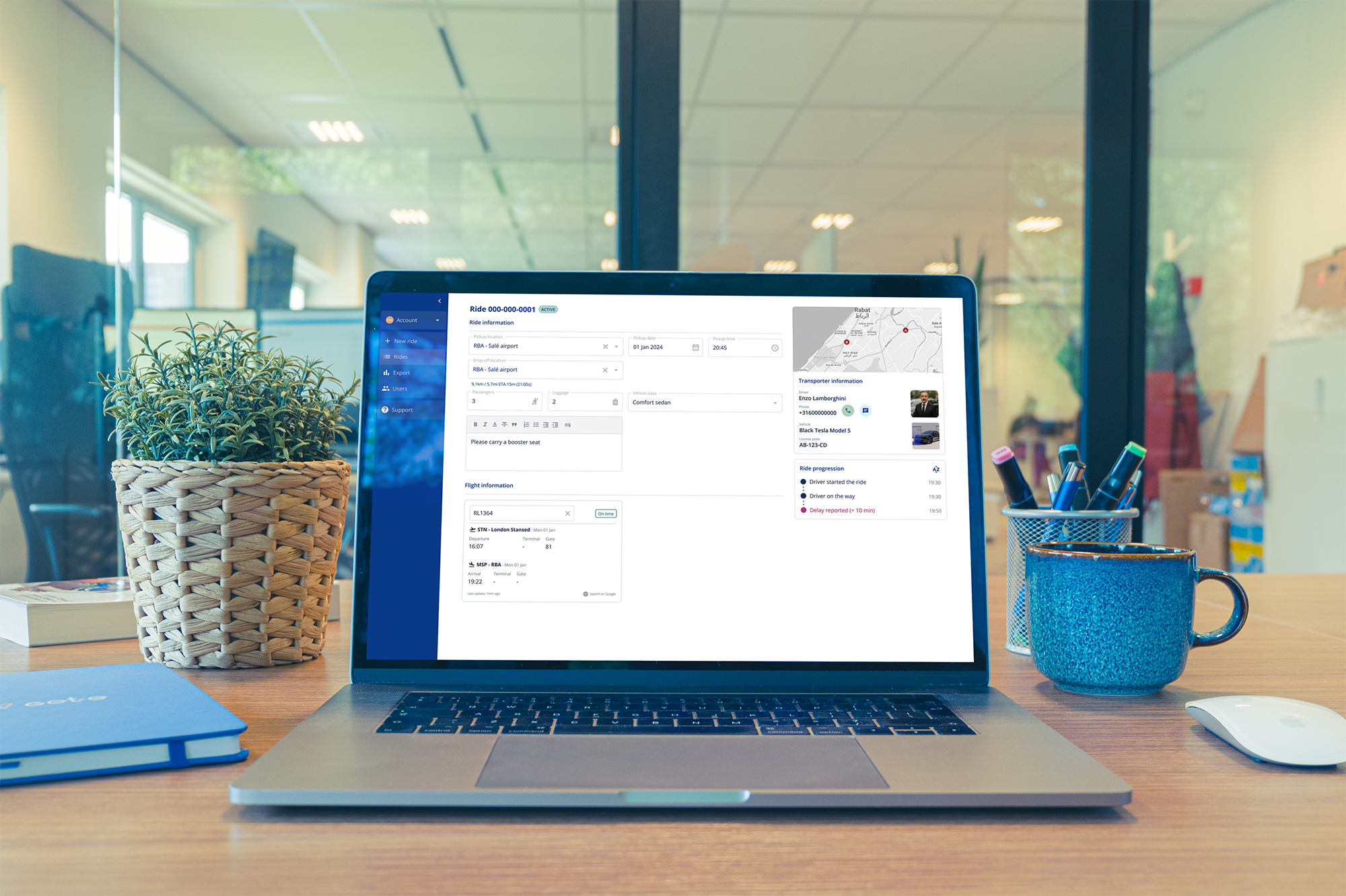
The ride page gives bookers full visibility and control. Non-editable details like driver and vehicle sit on the right, editable fields can be updated inline, and a clear timeline shows the ride’s progression in real time.
Structured for dispatch efficiency
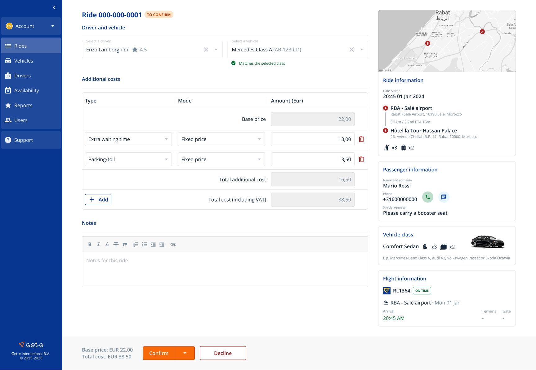
For dispatchers, editable fields such as driver, vehicle and extra costs are grouped on the left for quick updates. The right column holds fixed ride information, so critical details stay visible while actions are taken.
Mobile view
Around 50% of supplier-side traffic came from mobile devices. A simple responsive view was not enough for their daily workflows, so we created an experience optimized for mobile. Key actions like confirming rides or updating availability were prioritized, giving dispatchers the flexibility to manage operations on the go.
Delivery and outcomes
The redesign delivered more than fresh screens. For the first time, the company had a shared design system, a reusable component library, and complete flows and personas that are now part of internal training. Two portals were built on the same codebase but each one was tailored to its own users.
Outcomes and improvements
+71%
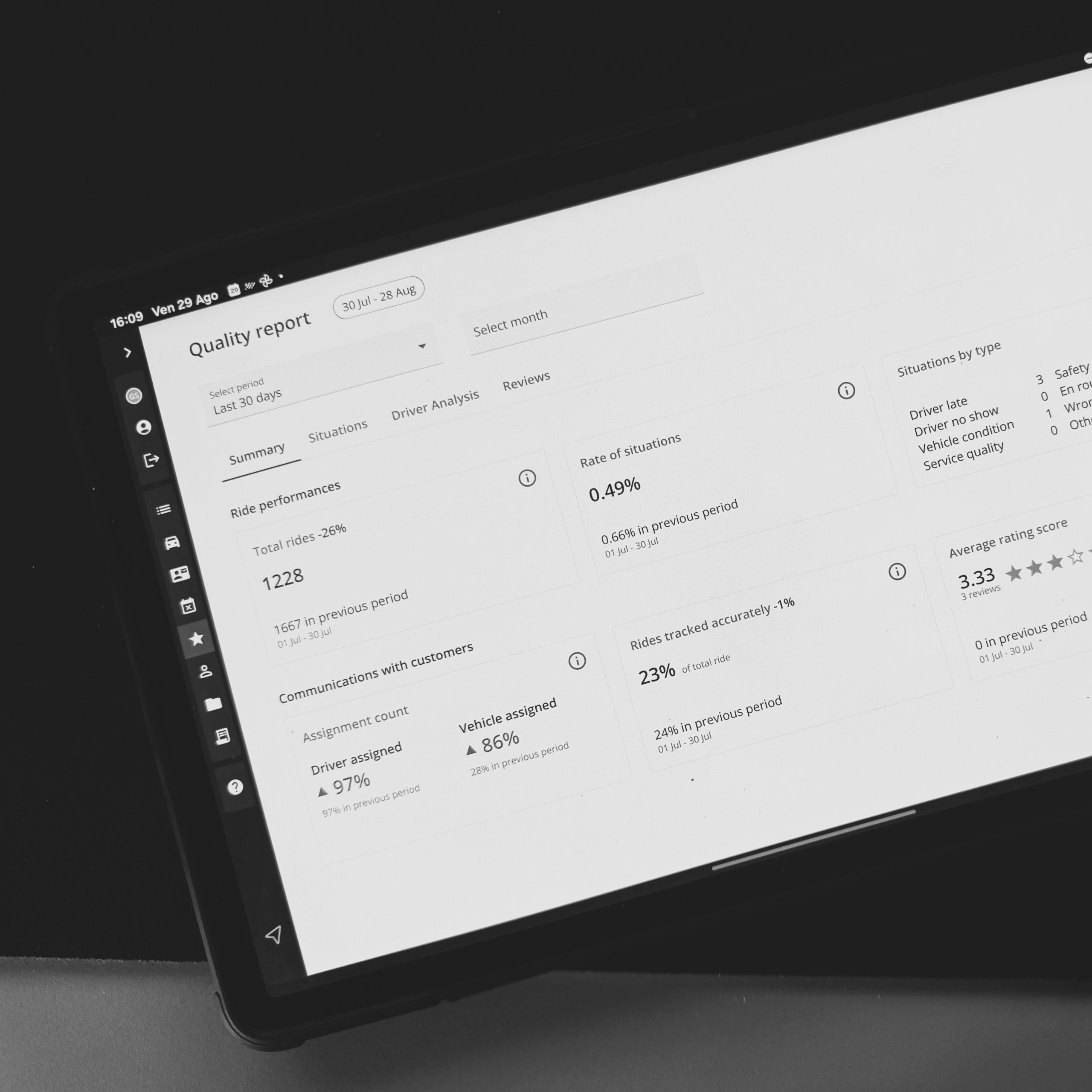
More interactions with +15% daily active supplier users and +22% daily active customer users.
-19%
Ride cancellations. It's now easier than ever to make reliable changes without cancelling a ride.
-10%
Incidents reported with more reliable driver pickups and less no-show.
LEssons from the ride
Key Takeaways
Design for different priorities
Customers and suppliers may look at the same rides, but they need very different things. Tailoring each view made the portal faster and easier to use.
Systems scale, screens don't
The new component library created consistency across the product and set the stage for faster future iterations, not just a prettier interface.
UX culture cannot be imposed
You cannot force a company to adopt design practices. Real change starts when teams see how understanding user needs makes their work easier and their results stronger.