UX and UI for a gym website and its streaming service
From Gym website to streaming platform
Quisquash is a local gym known for its squash courts and indoor pool, but its online presence was stuck in the 2010s. Froglab, the agency I worked with, was asked to redesign the brand and website to match the newly renovated facilities.
Just as the launch was ready, COVID shut the gym down. Instead of pausing, we turned the redesign into a springboard for a streaming platform where instructors could keep producing content and members could stay connected from home. It all started with a facelift, but then became something way more structured.
My role
I was responsible for the full design of the website and the streaming platform. This included research, information architecture, high-fidelity mockups, and collaboration with developers. I worked alongside a photographer and a brand designer to ensure the new identity was consistent across digital and physical communication.
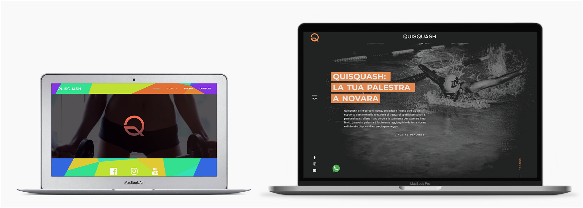
Era-accurate representation of the old website (left) compared to the new one
The process
Research
Quisquash had a loyal base of young to middle-aged professionals with passions like boxing, swimming and yoga, and attracted new members drawn by the renovated facilities. The owners wanted the website to match their ambition, citing high-end Milan gyms with bold titles, strong contrasts and oversized photography. Members were relying on WhatsApp with the instructors, messages that went unread and raised privacy issues.
Three were they key pain points that came out from the research:
Three were they key pain points that came out from the research:
- Outdated image – the site no longer reflected the gym’s ambition. Quisquash had invested in facilities and instructors, but the website looked like a 2010s blog.
- No online booking – members could not subscribe, book classes, or manage memberships online. Everything depended on manual work.
- No communication channel – with no space for updates on the site, instructors relied on SMS, which was fragmented and inefficient.
These insights showed us that the app was asking too much from drivers while giving too little in return, and that the tracking experience on the customer side was unreliable.
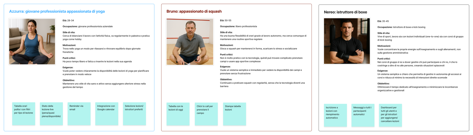
User research outcomes for different personas
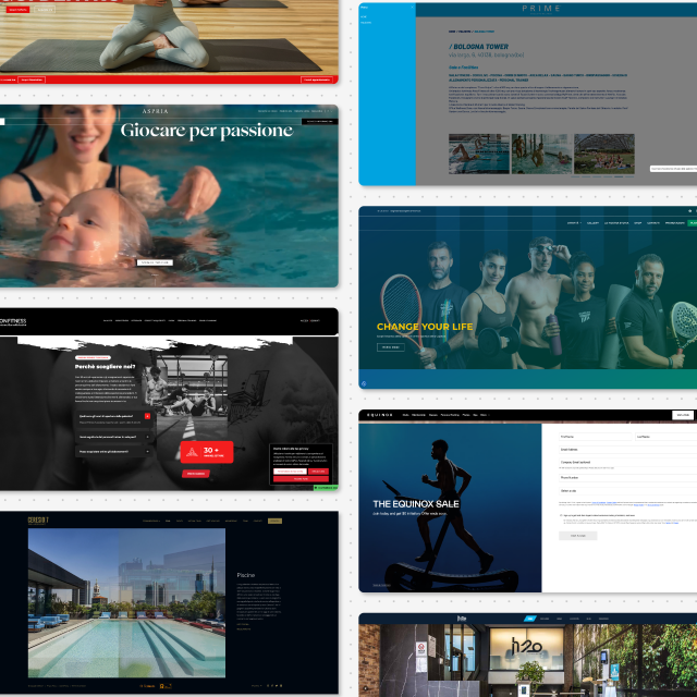
Finding a design reference
The old website was the result of a dated redesign that no longer matched the gym’s ambitions. Its colour scheme, typography and lack of mobile optimisation made Quisquash look like a local gym rather than a place where national-level athletes trained.
Together with the owners, we set out to reposition the brand closer to Milan’s high-end gyms, using strong contrasts, bold typography and large hero images — a visual language that resonated with their main audience of young athletes and professionals.
Together with the owners, we set out to reposition the brand closer to Milan’s high-end gyms, using strong contrasts, bold typography and large hero images — a visual language that resonated with their main audience of young athletes and professionals.
Define
From the research, we identified two main needs: a modern brand identity for the owners and a practical tool for members. For the MVP, I proposed delivering immediate value while keeping the structure flexible for growth:
- A complete redesign of the website to align with the gym’s new image.
- A personal area where members could check timetables and read news.
- A flexible structure that could later support new features.
I don't want to be the one saying no to a paying customer when a class is full.
Insight from SPIn instructor
Design
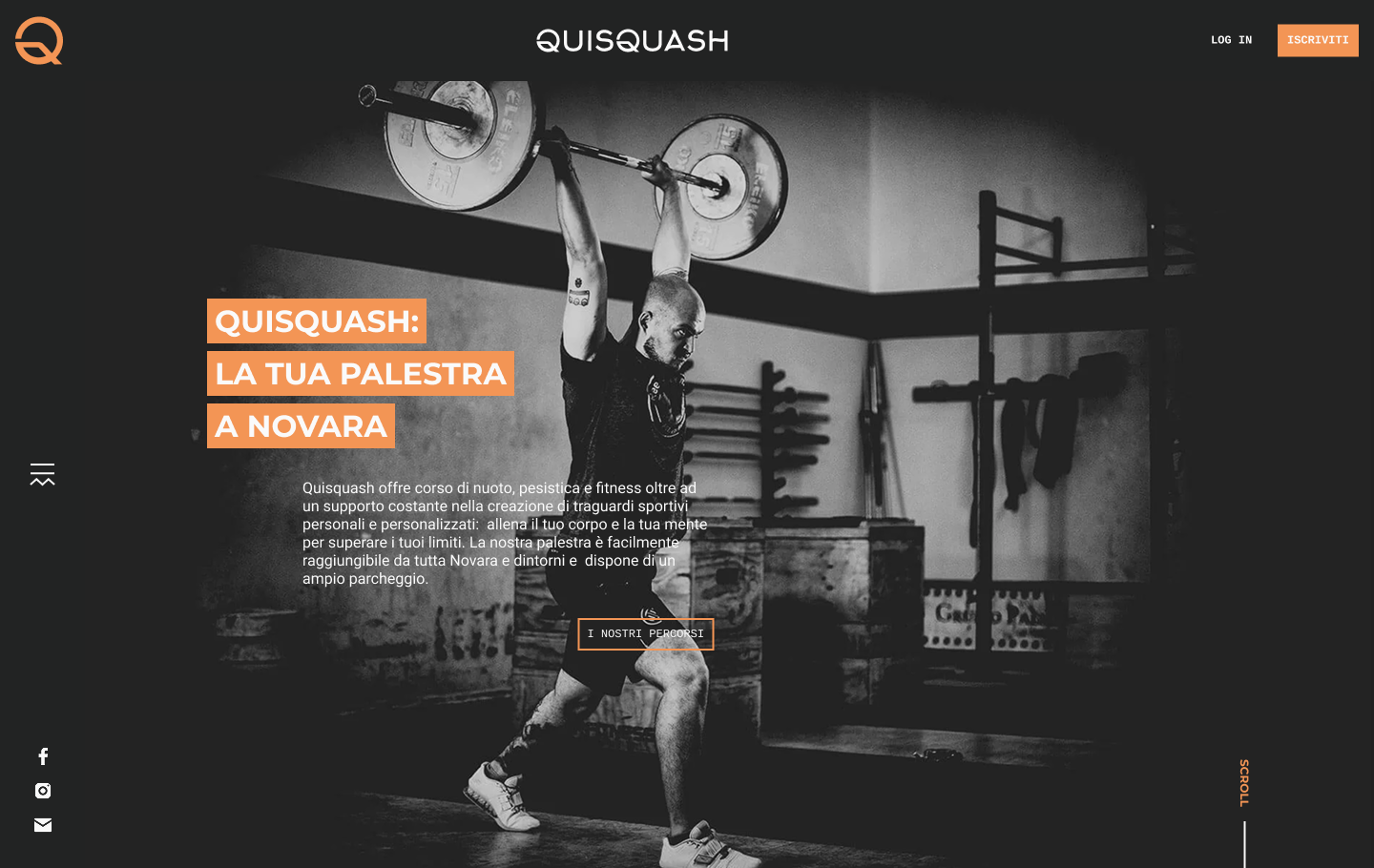
With priorities defined, I shifted focus to bringing the new identity to life. The goal was to give Quisquash a digital presence that felt bold, modern and professional, while keeping the experience simple enough for all members to use. I explored visual directions, then designed key pages and interactions to balance brand expression with everyday usability.
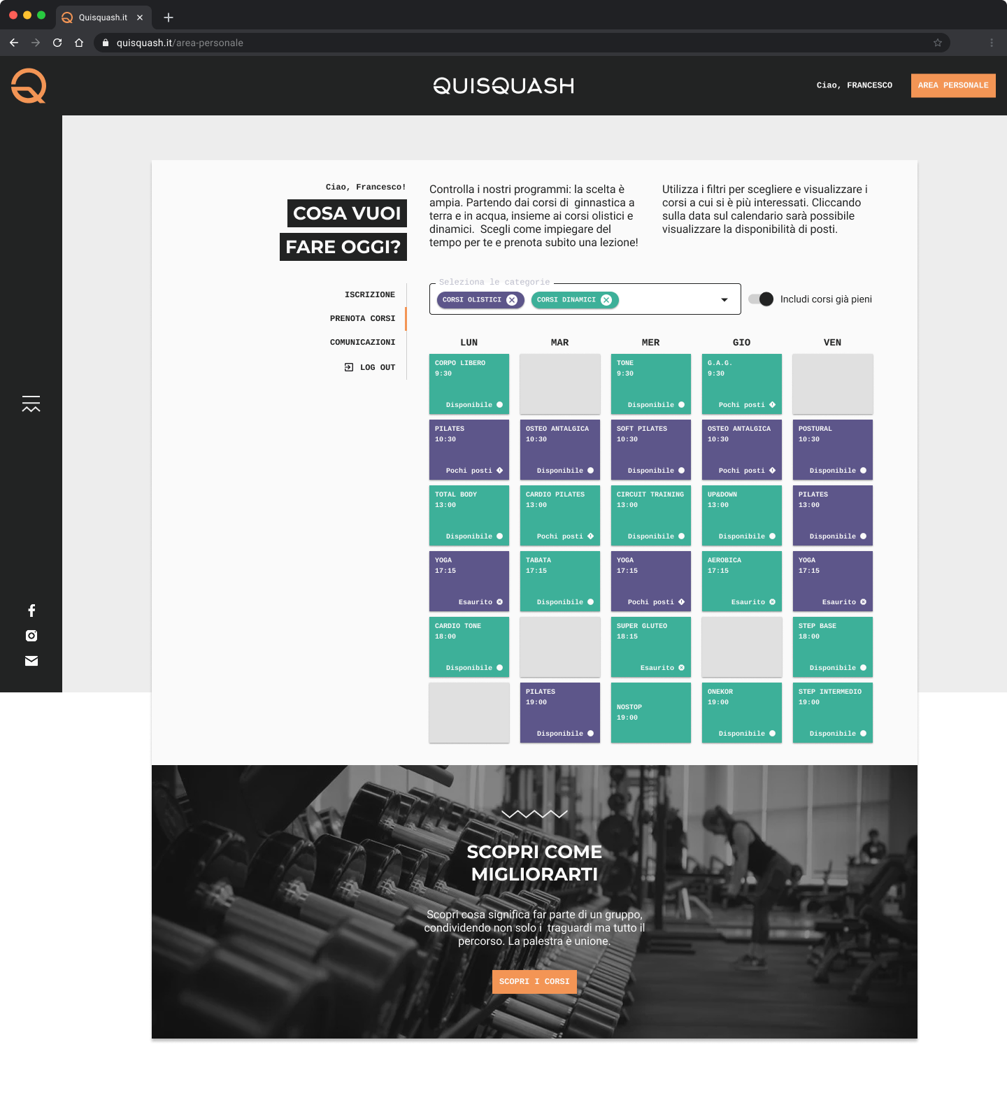
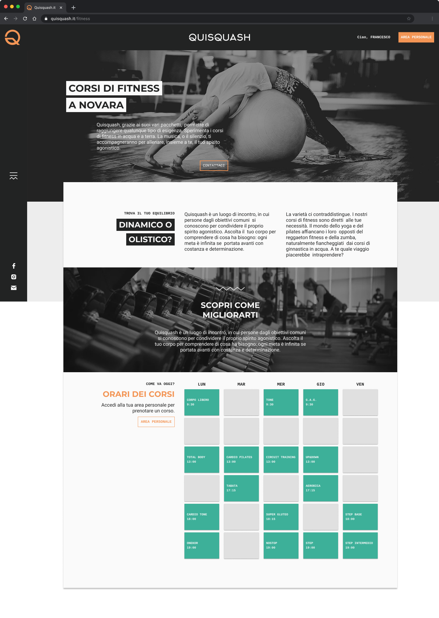
Thrilling screenshots of boxes and menus (designers’ guilty pleasure)
Delivery?
From Gym website to streaming platform
The website was ready for launch when COVID shut everything down. Members were stuck at home, instructors could still reach the gym, but no one else was allowed inside. Suddenly, the redesign became less relevant. We needed to keep members engaged.
Instead of pausing, I repurposed the new personal page into a streaming platform. This gave members access to live and recorded classes from home, while instructors could keep teaching from the gym.
Instead of pausing, I repurposed the new personal page into a streaming platform. This gave members access to live and recorded classes from home, while instructors could keep teaching from the gym.
The realization
We considered building a Netflix-style catalogue with subscriptions, but that would have delayed launch and excluded members who already paid gym fees. Instead, I kept it lightweight: playlists and categories within the personal area. I studied Twitch for its live interaction patterns and YouTube for its simple categorisation, combining these references into a stripped-down structure that matched our scope.
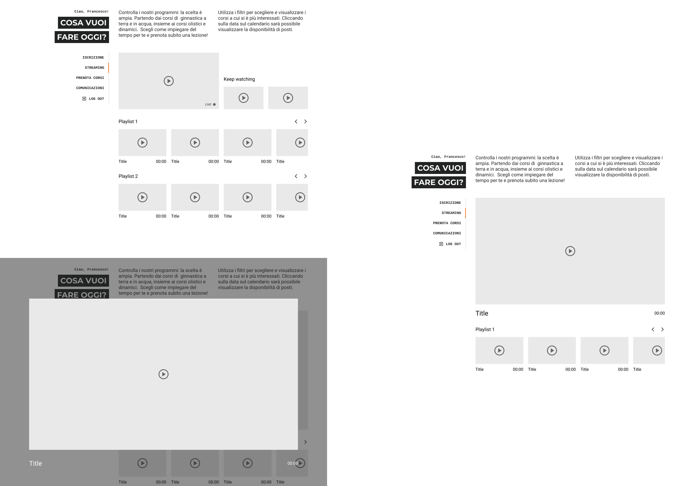
Some early stage wirerames for the streaming services
Cutting through the noise
The aim was to keep things simple: members could access classes from home, organised into playlists and categories. No new subscriptions or paywalls, just a direct extension of their gym membership.
The adaptation
I redesigned the personal page into a lightweight streaming hub. Instructors could broadcast live sessions or upload recordings, and members could log in to follow classes. By building on top of what we had, we delivered quickly.
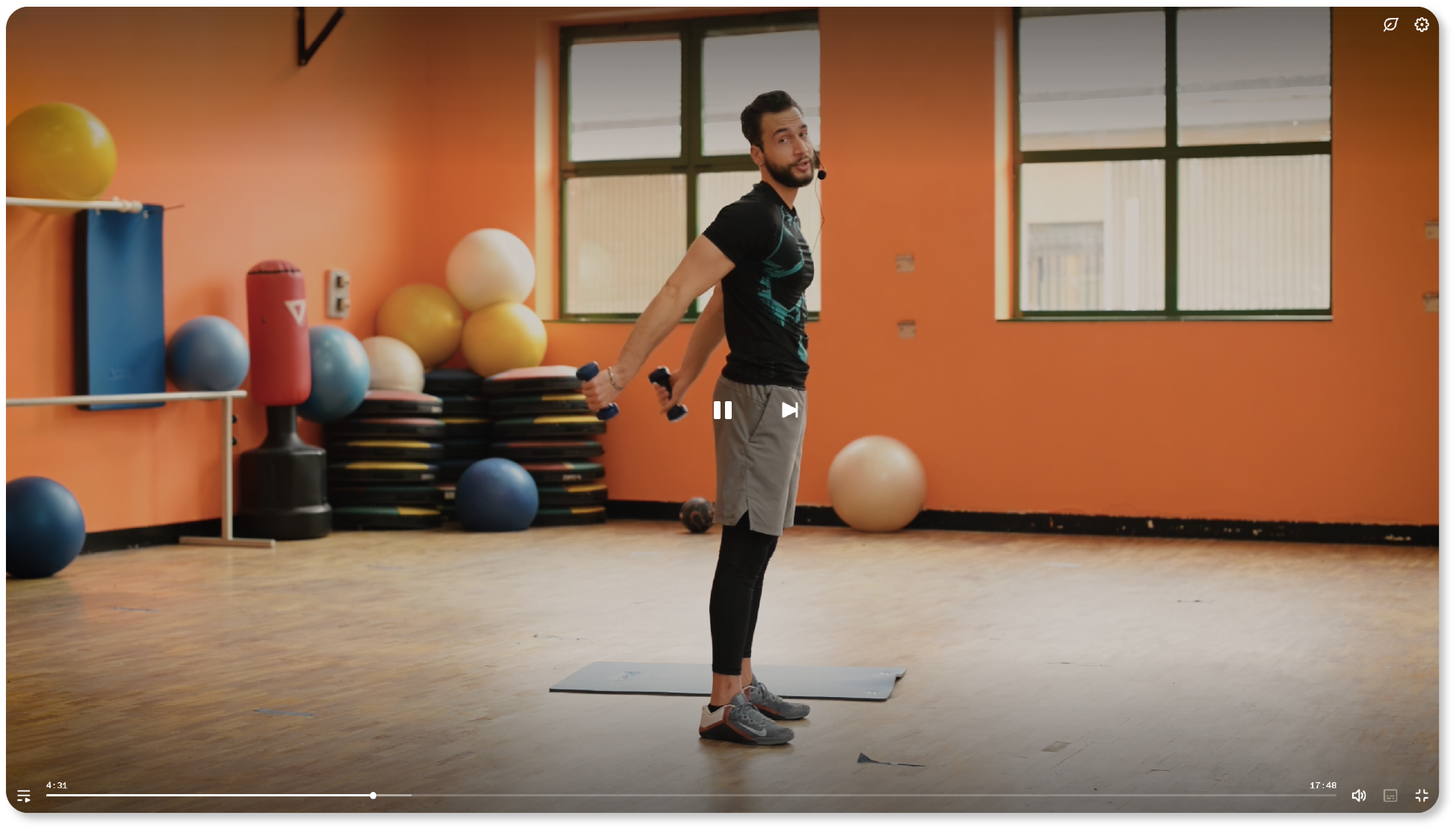
Delivery and outcome
The streaming page came together rapidly, built on top of the personal area I had already finished. Members could log in, choose a category, and either join a live session or replay a recorded class. The design was intentionally simple so even less tech-savvy members could use it without guidance. Instructors finally had a way to reach their audience without juggling WhatsApp groups or turning people away at the door.
Looking back, this was more than a temporary fix: the streaming page gave Quisquash a way to stay alive during lockdown, and it showed how design can adapt to unexpected events and still deliver value. It was not as polished as YouTube or Twitch, but it did exactly what the community needed at the time: it kept people connected and moving.
Looking back, this was more than a temporary fix: the streaming page gave Quisquash a way to stay alive during lockdown, and it showed how design can adapt to unexpected events and still deliver value. It was not as polished as YouTube or Twitch, but it did exactly what the community needed at the time: it kept people connected and moving.
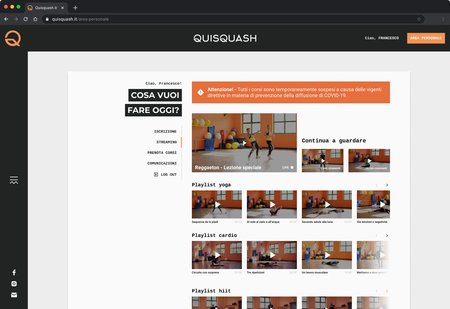
Finding the right class at a glance
Members could scroll through playlists and pick what they liked the most. The layout was kept simple and familiar, so it felt easy to start or continue a workout.
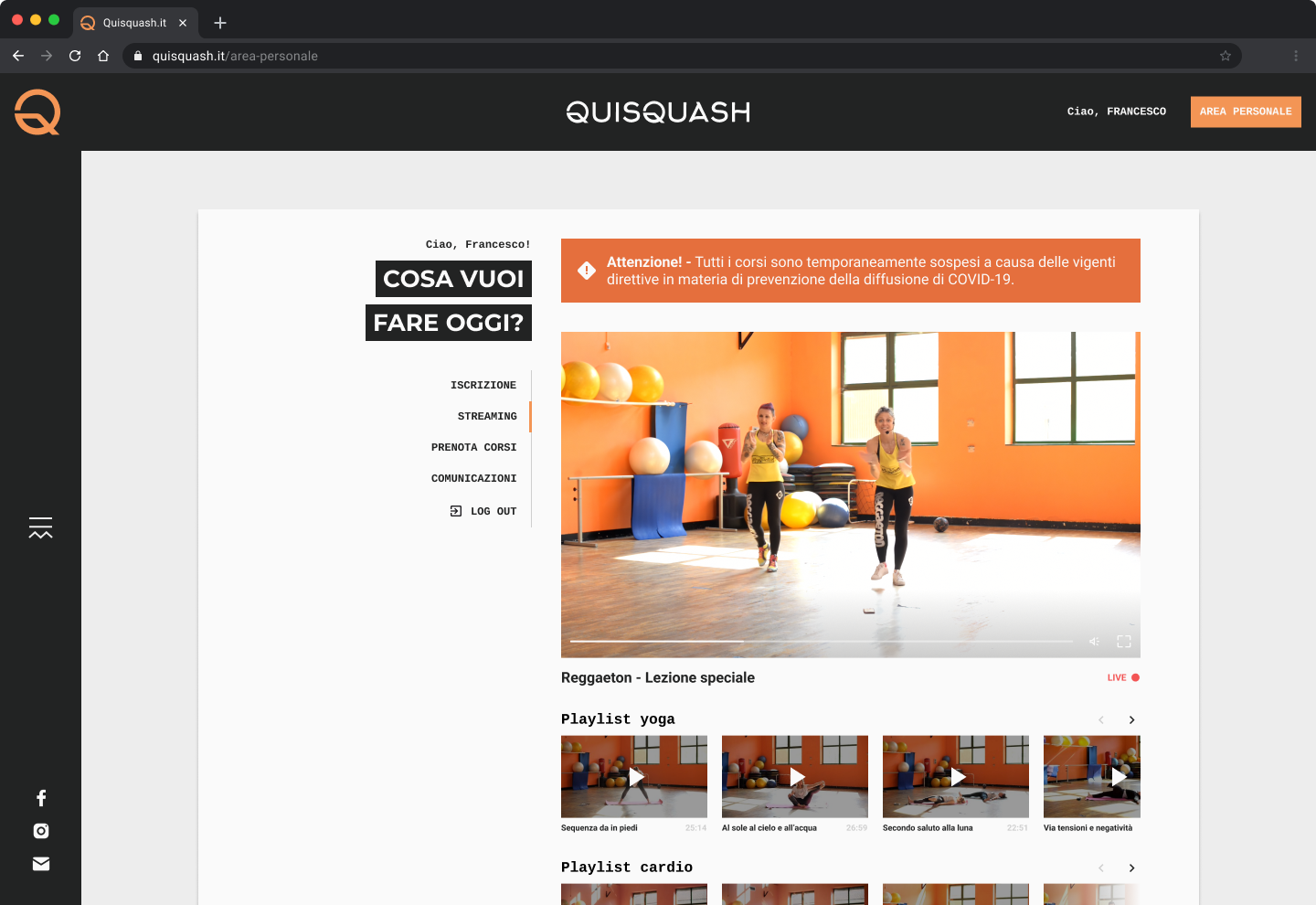
Focus on one video
Selecting a video expanded it into a larger view with full details while still keeping the rest of the catalogue within reach.
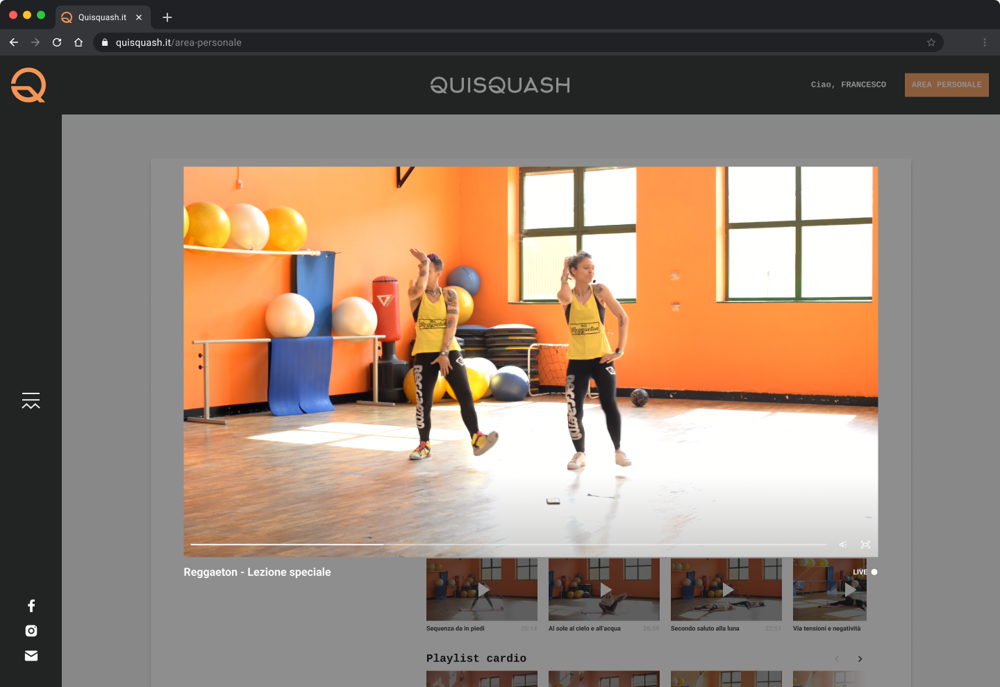
Immersed in the workout
Members could switch to immersive mode for a more engaging experience. This gave instructors the presence of a real class and helped participants feel connected.
Outcomes
The streaming hub became the gym’s lifeline during lockdown. Members stayed connected through live and recorded classes, while instructors had a reliable way to reach their audience without fragmented messaging. What began as a facelift for the website ended up extending the gym’s services into the home, proving how design can adapt quickly and deliver value even in uncertain times.
While the streaming hub proved valuable during lockdown, it also turned out to be an expensive feature to maintain. In the long term, most members naturally returned to in-person training, and the service was phased out. Still, at its peak the platform hosted more than 100 recorded classes and live sessions, ensuring Quisquash could keep serving its community when many other gyms in town were forced to close entirely: now the videos are available for free to everybody as a thank you for the support during such an hard time.
While the streaming hub proved valuable during lockdown, it also turned out to be an expensive feature to maintain. In the long term, most members naturally returned to in-person training, and the service was phased out. Still, at its peak the platform hosted more than 100 recorded classes and live sessions, ensuring Quisquash could keep serving its community when many other gyms in town were forced to close entirely: now the videos are available for free to everybody as a thank you for the support during such an hard time.
LEssons from the ride
Key Takeaways
Adapt quickly
Repurposing the personal area into a streaming hub kept members active despite lockdown.
Plan in advance
Flexible architecture meant we could pivot without starting from scratch.
Design for people
The focus was not on advanced features, but on giving members and instructors a simple way to stay connected.